






1
clear home hub
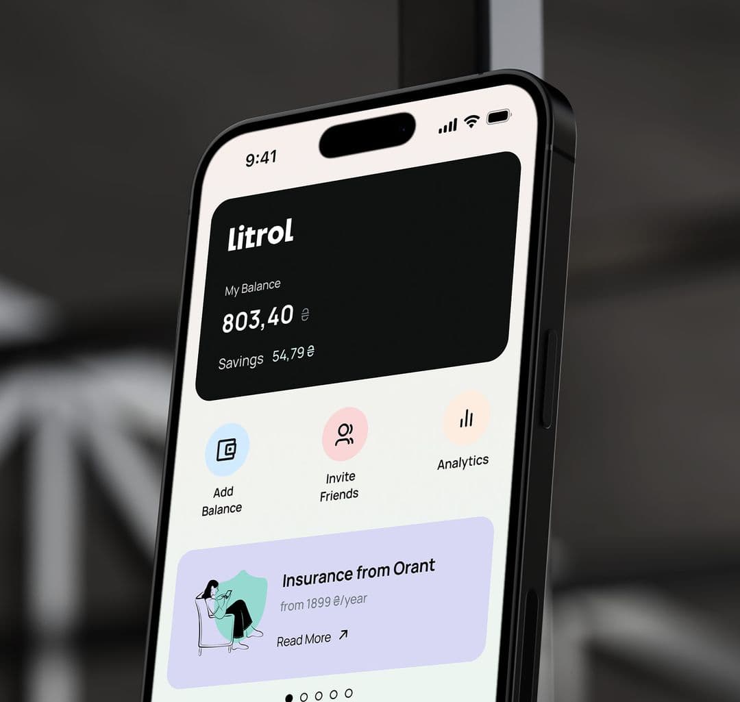
Balance, savings, transactions and priority actions were reorganized around one main screen.

HQ Paphos, Cyprus · worldwide
99 Francs redesigned the mobile interface for a fuel and energy app that helps drivers buy fuel with discounts, manage balance, track savings and pay without waiting in queues.
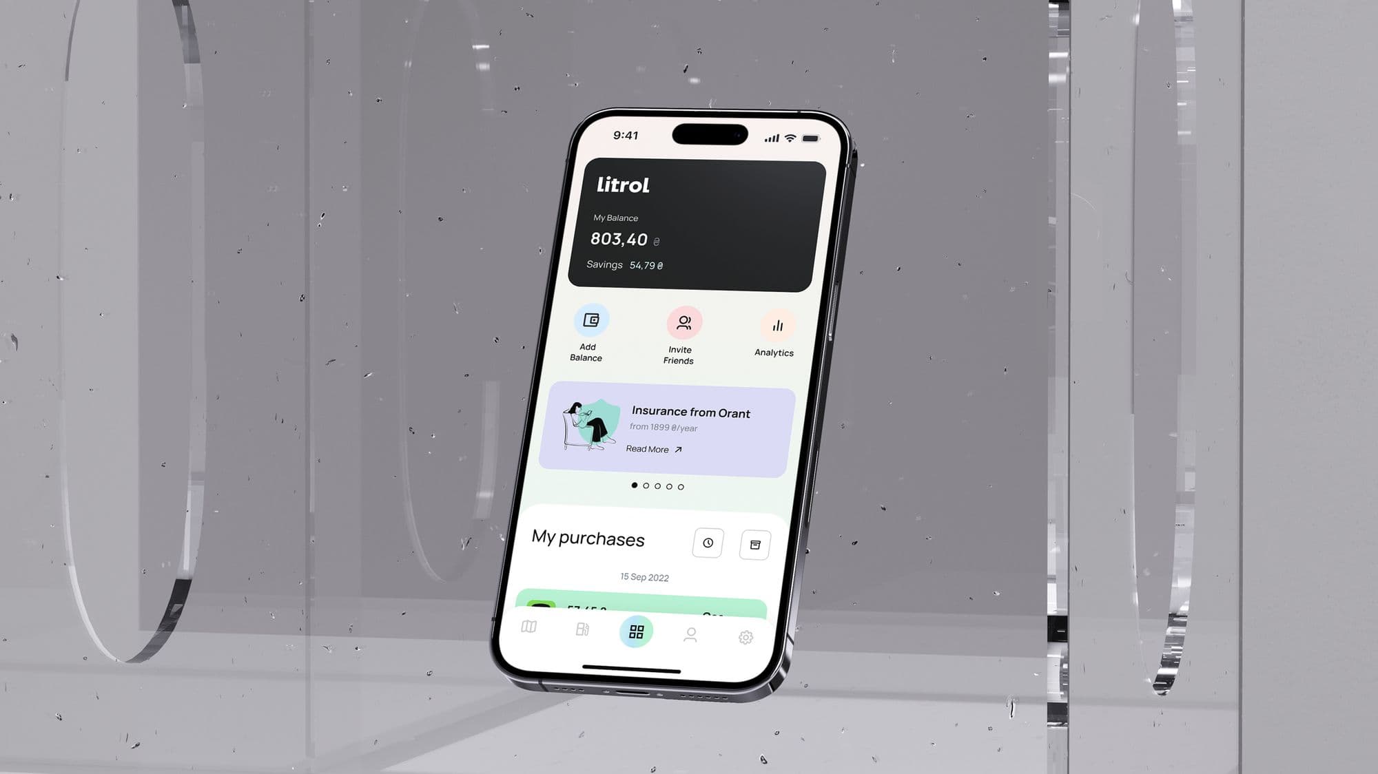

The visual system keeps the app calm and readable while making the key financial state visible: balance, savings, replenishment and purchases.
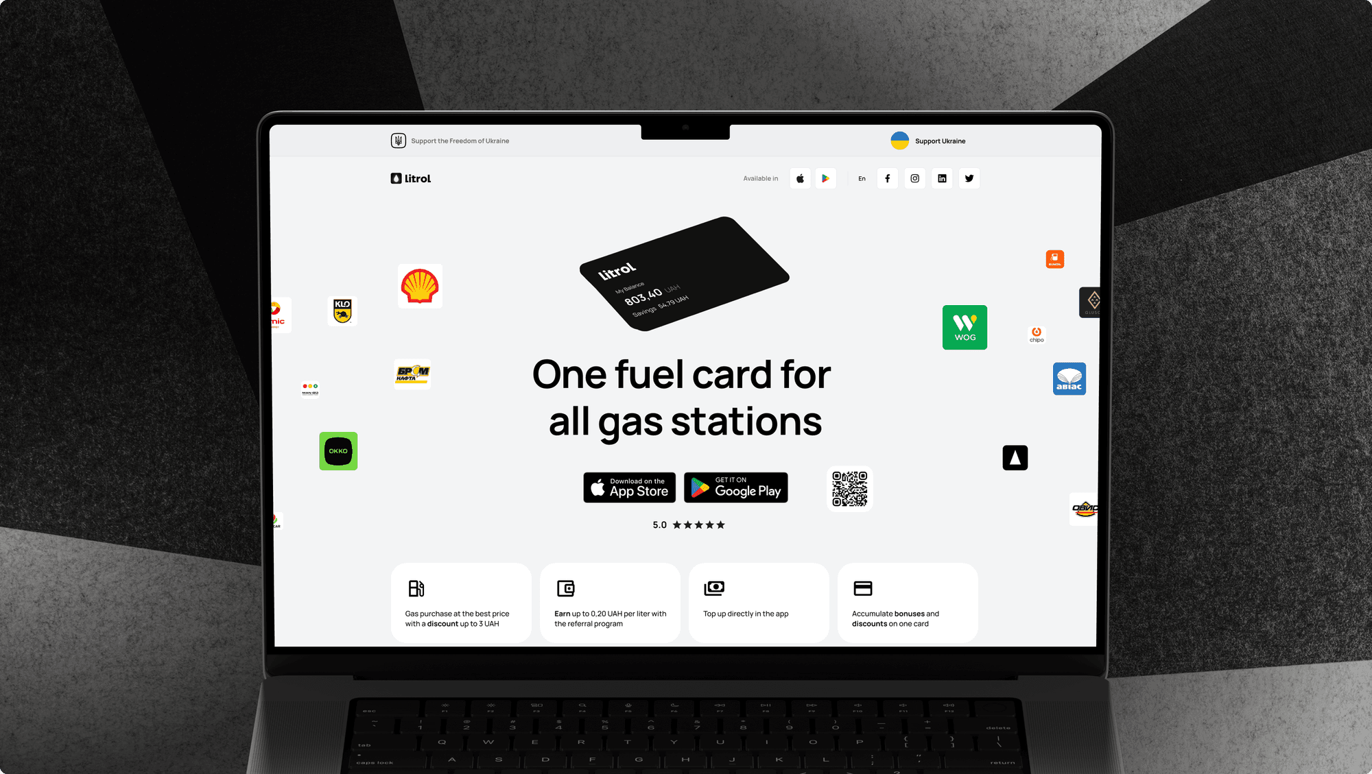
The redesign focused on the main screen, navigation, balance replenishment, transaction access, feature discovery and a promotional landing page that could explain the app to new users.
For a fuel app, users need fast answers: how much money is available, where the savings are, what they bought and which action comes next.
1
Balance, savings, transactions and priority actions were reorganized around one main screen.
5
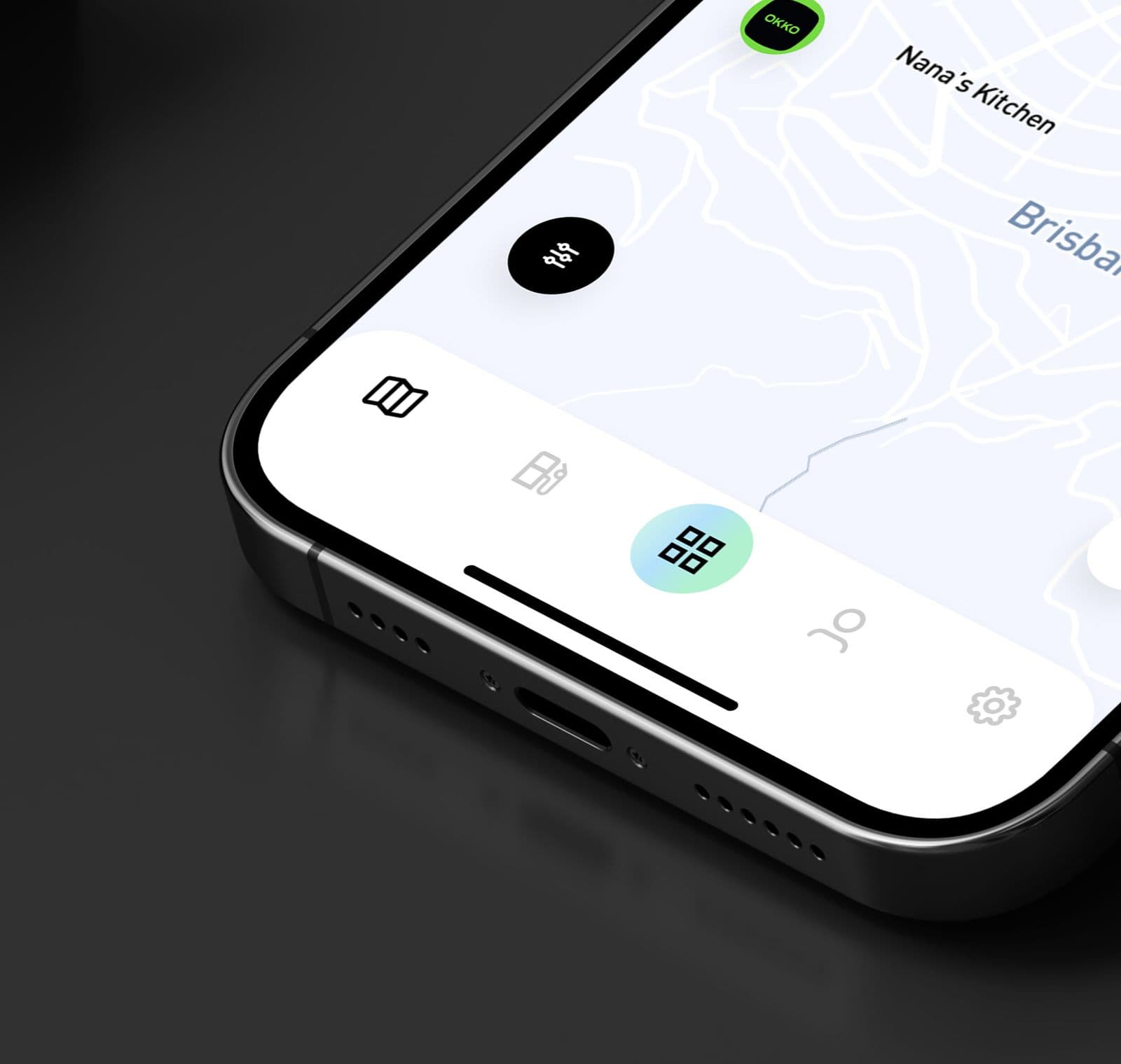
Map, gas stations, home, profile and settings were separated into a navigation model users can understand quickly.
2
The project covered the mobile app interface and a promotional landing page for customer acquisition.
Litrol needed a new main screen that could show the app's value immediately: balance, replenishment, savings from refueling, transactions and additional features without making the interface feel overloaded.
Drivers open the app to understand whether they can pay, save or top up. We made the account balance, savings and replenishment path visible before secondary content.
Referral, statistics and insurance features were not hidden in deep settings. They became clear actions inside the home experience, where users can discover them naturally.
The bottom navigation separates map search, station context, the account hub, profile and settings. This keeps refueling tasks and account tasks from competing on one screen.
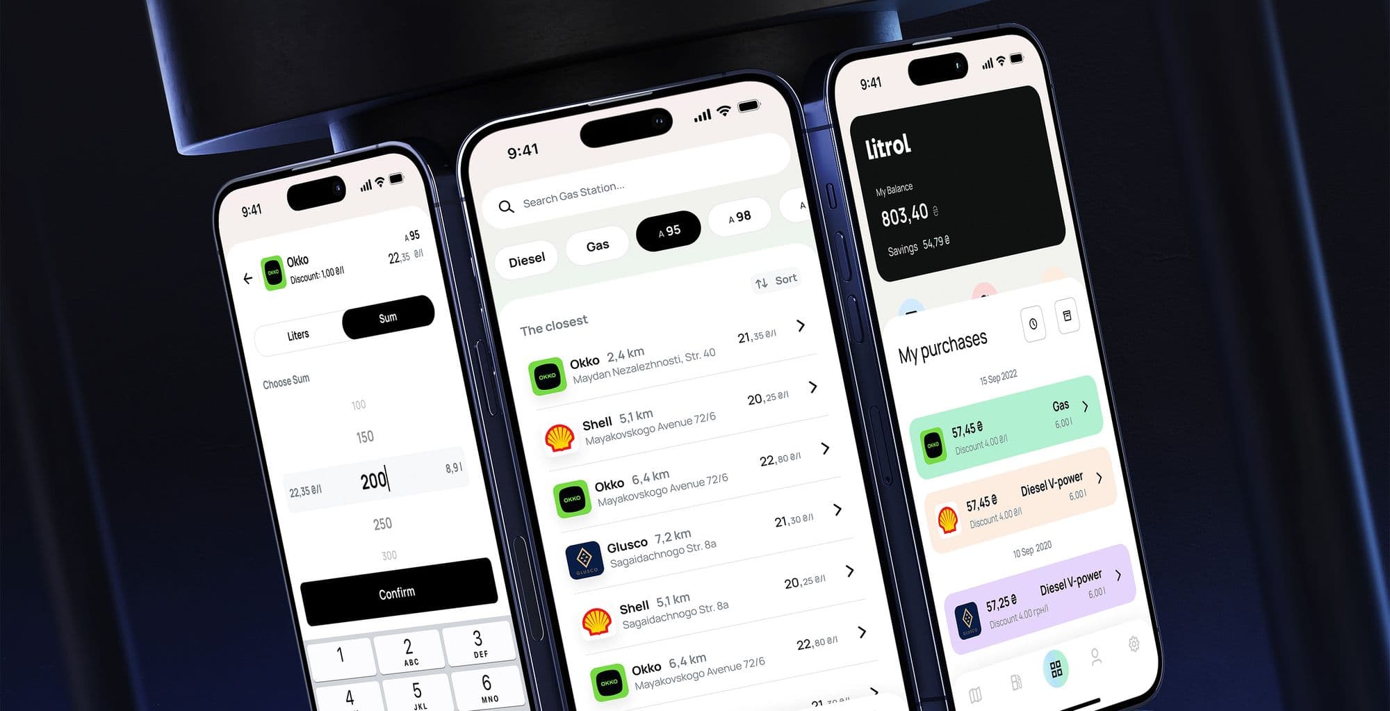
We prioritized the financial state first, then supporting actions: top up, invite friends, check analytics, review purchases and move to the archive when older transactions are needed.
The process followed the same pattern we use for mobile app design services: understand the user job, define the critical flow, design UI states and prepare the product story for launch.
We reviewed the existing product idea, payment flow, refueling use case, discount mechanics and places where users needed faster access to information.
The home screen became a practical command center: current balance, top-up action, savings, purchases, referral entry points, analytics and insurance offers.
We simplified switching between maps, stations, user profile and settings so the app could support both quick refueling and repeated account management.
After the app UX/UI work, we designed a landing page that explains the product, highlights the most important app features and helps attract new users.
A clearer bottom navigation lets drivers move between nearby stations, fuel context, the main account screen and personal settings without learning a custom menu system.
We designed the promotional landing page to explain Litrol's most important features, preview upcoming functionality and turn the app story into an acquisition surface.
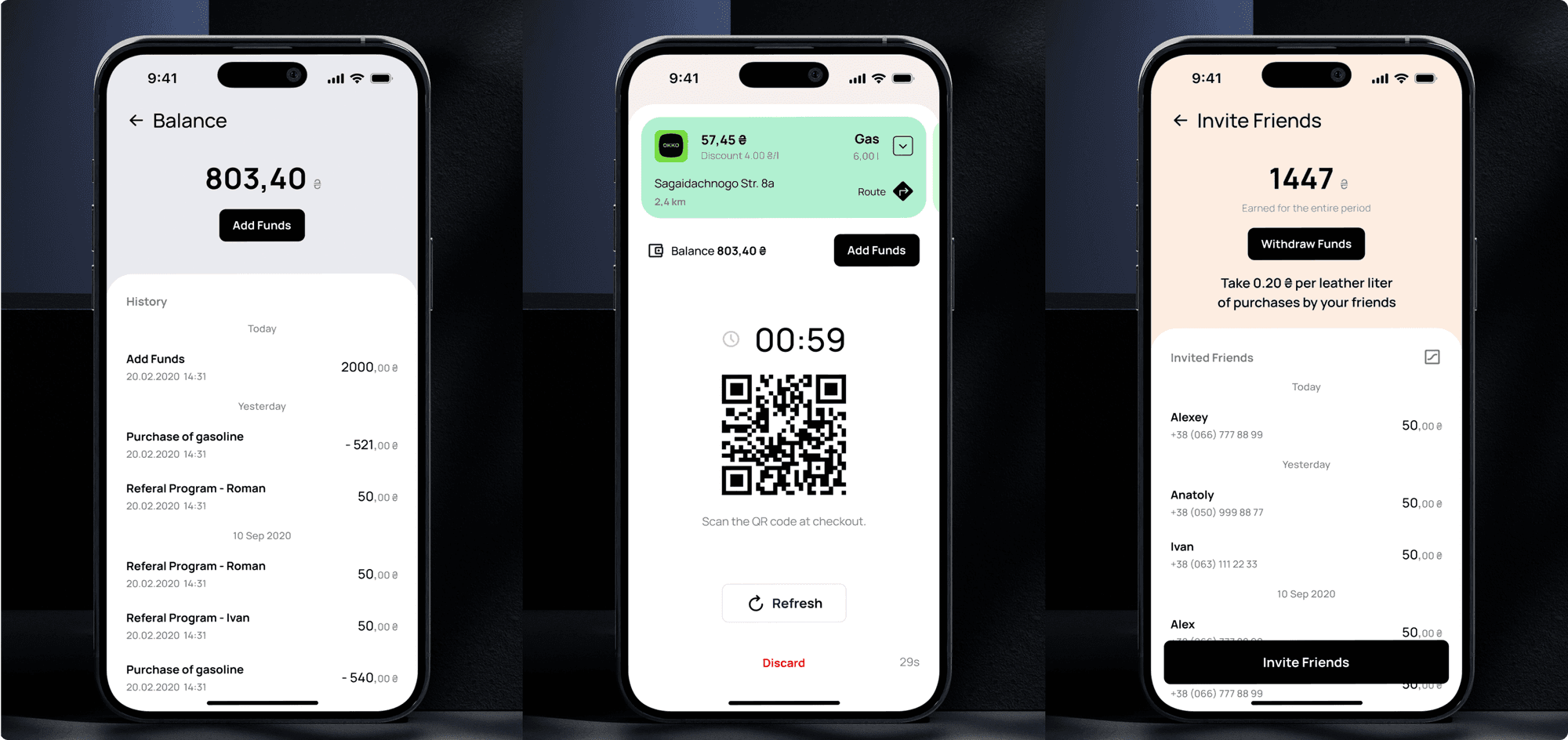
The redesign gave Litrol a more useful main screen, clearer navigation and a visual system that highlights the app's strongest features.
Alexander Vinokurov · CEO 99F, Art Director
Need a mobile app that feels clear before it becomes expensive to build?
The project included UX audit, mobile app interface design, navigation design, product hierarchy, high-fidelity UI, visual direction and landing page design. See the related mobile app design services.