1
clear outage schedule
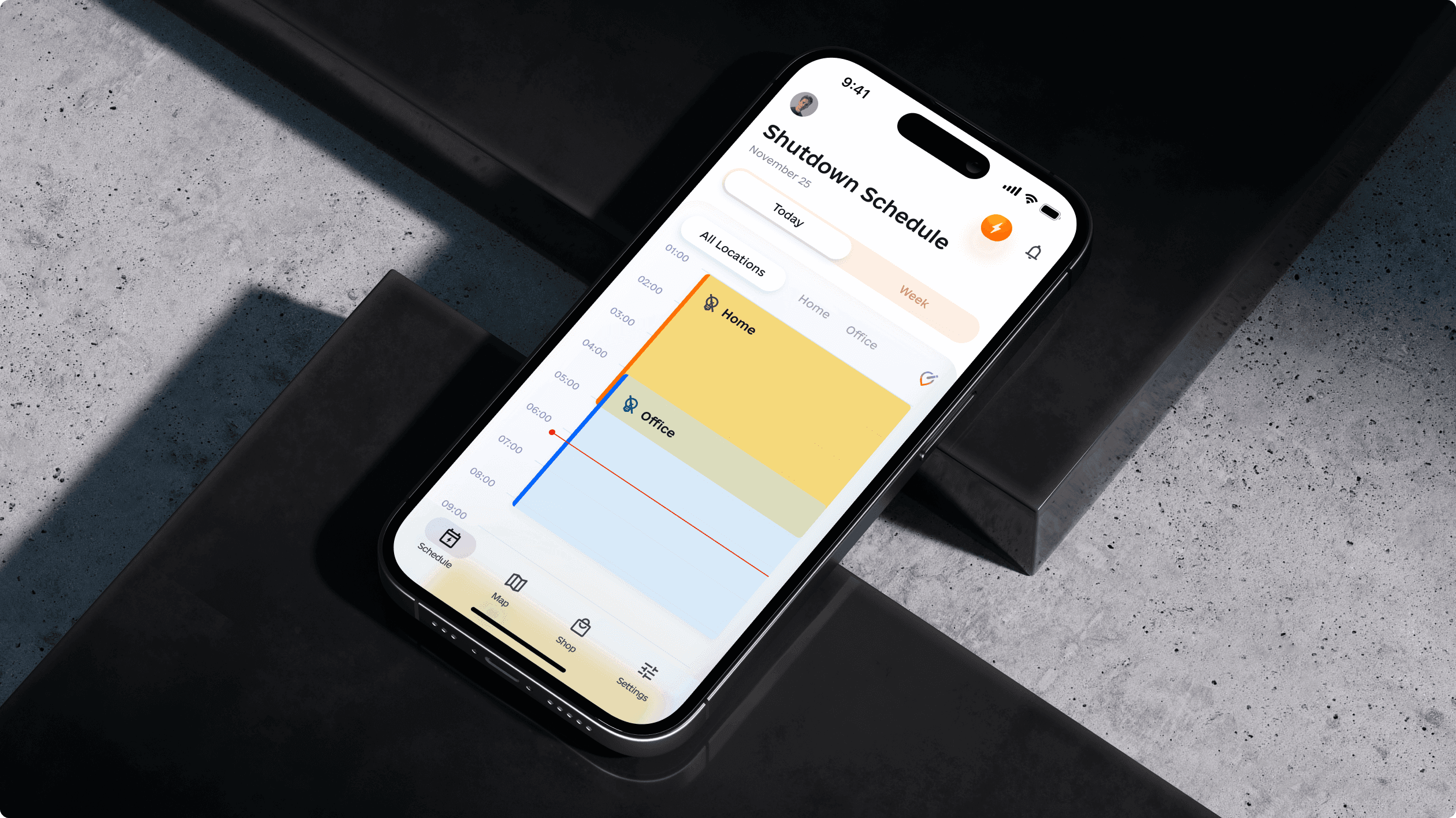
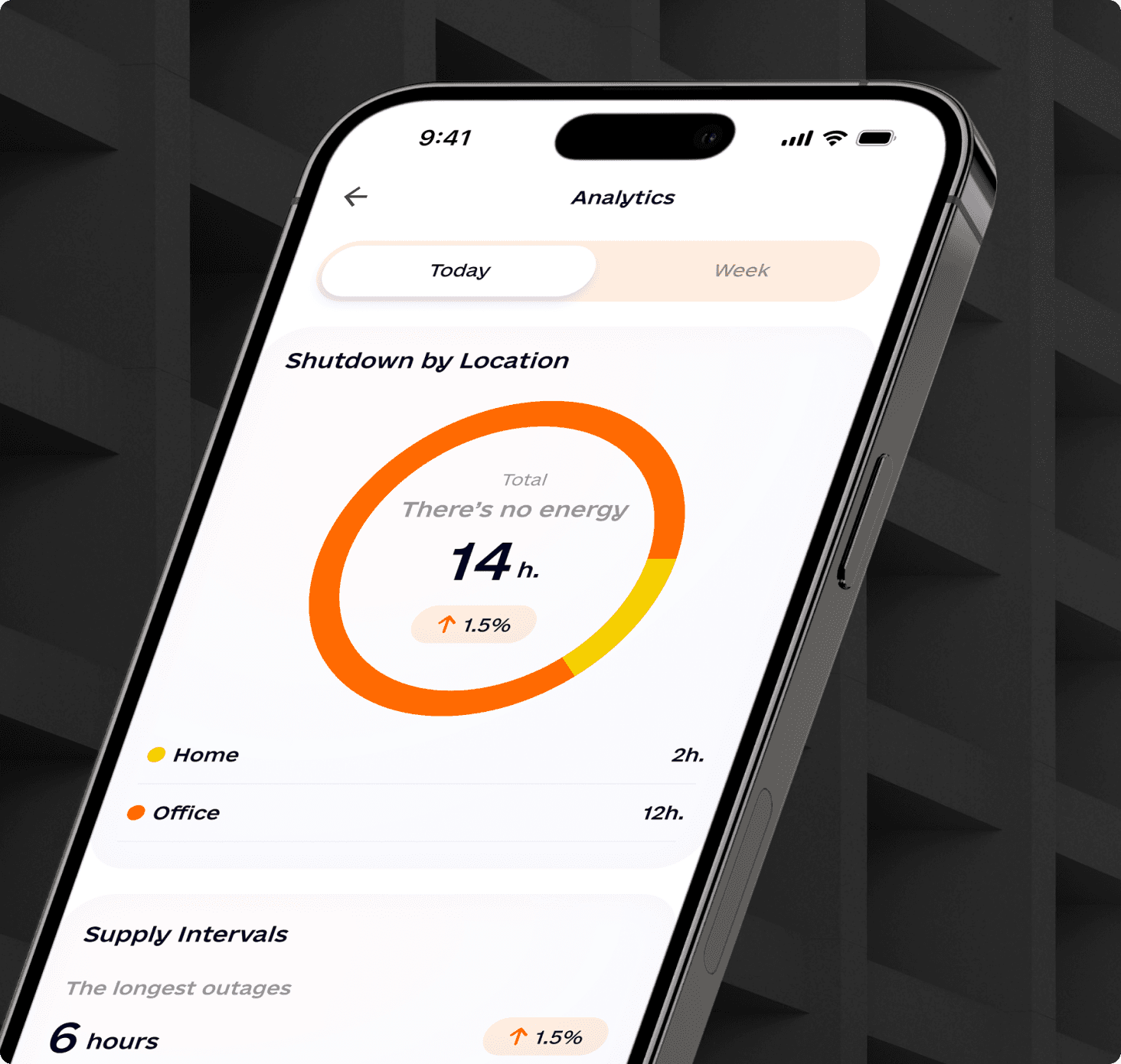
The app experience centers on a schedule users can understand quickly during electricity outages.
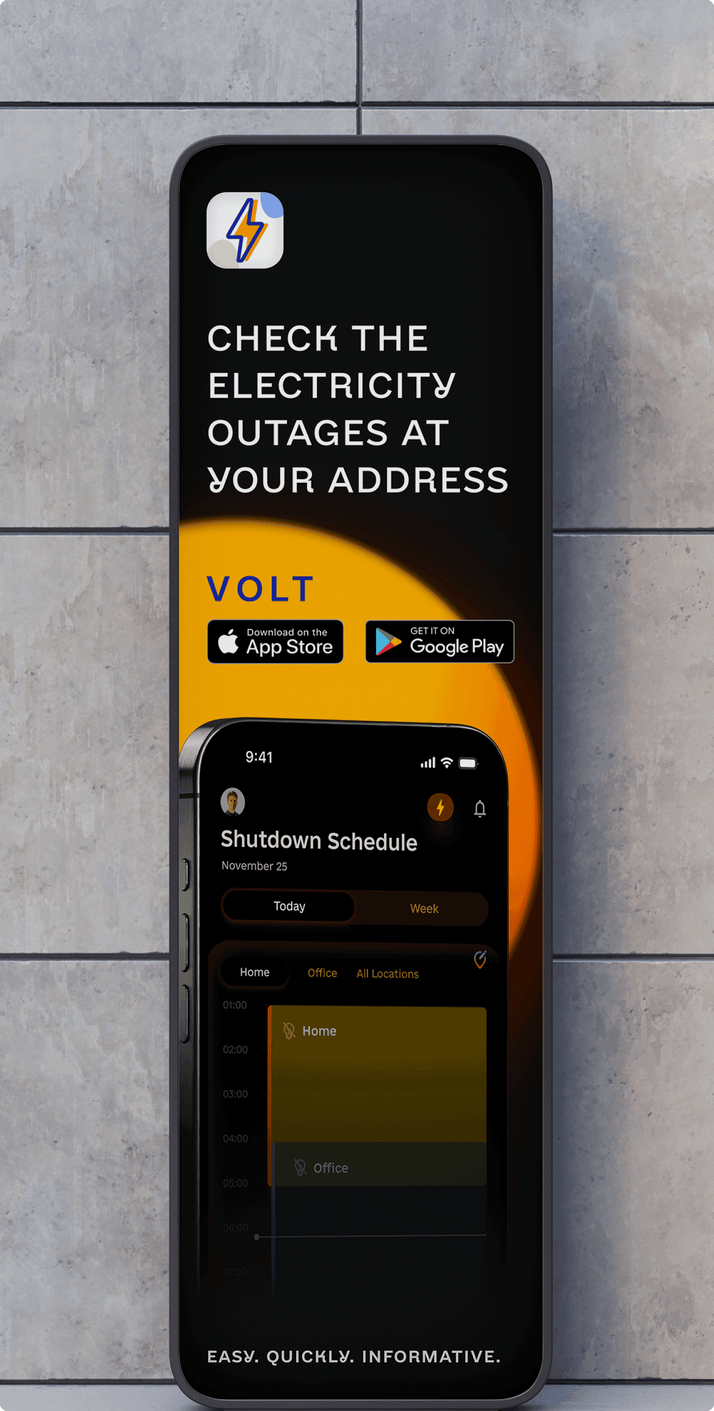
99 Francs designed a mobile application that helps users check current electricity outages, switch between locations and customize the places they want to monitor.
The app combines schedule clarity with a vivid identity so the utility experience feels functional, friendly and recognizable.
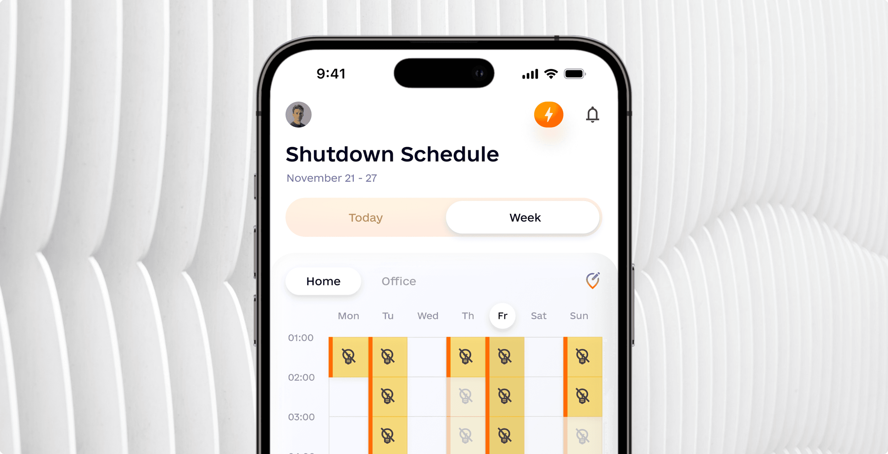
The design focused on outage schedules, favorite location management, smooth navigation and a bright identity system that makes the app easier to use during stressful utility interruptions.
The result blended a creative visual direction with the required functionality: checking active outage schedules and customizing locations.
1
The app experience centers on a schedule users can understand quickly during electricity outages.
2
Users can switch between locations and manage favorites without digging through a complex setup flow.
1
A bright identity and mobile UI language made a utility app feel more memorable and easier to approach.
Users needed an intuitive outage schedule, a way to switch between locations and simple controls for adding or removing favorite places without making the product feel like a settings-heavy utility.
Outage information loses value if users have to decode it. We made the schedule structure the main product signal.
Users can personalize the app around the places they care about, with clear add, remove and switch behavior.
Bright color, brand cues and expressive UI assets make the app easier to remember while keeping navigation smooth.
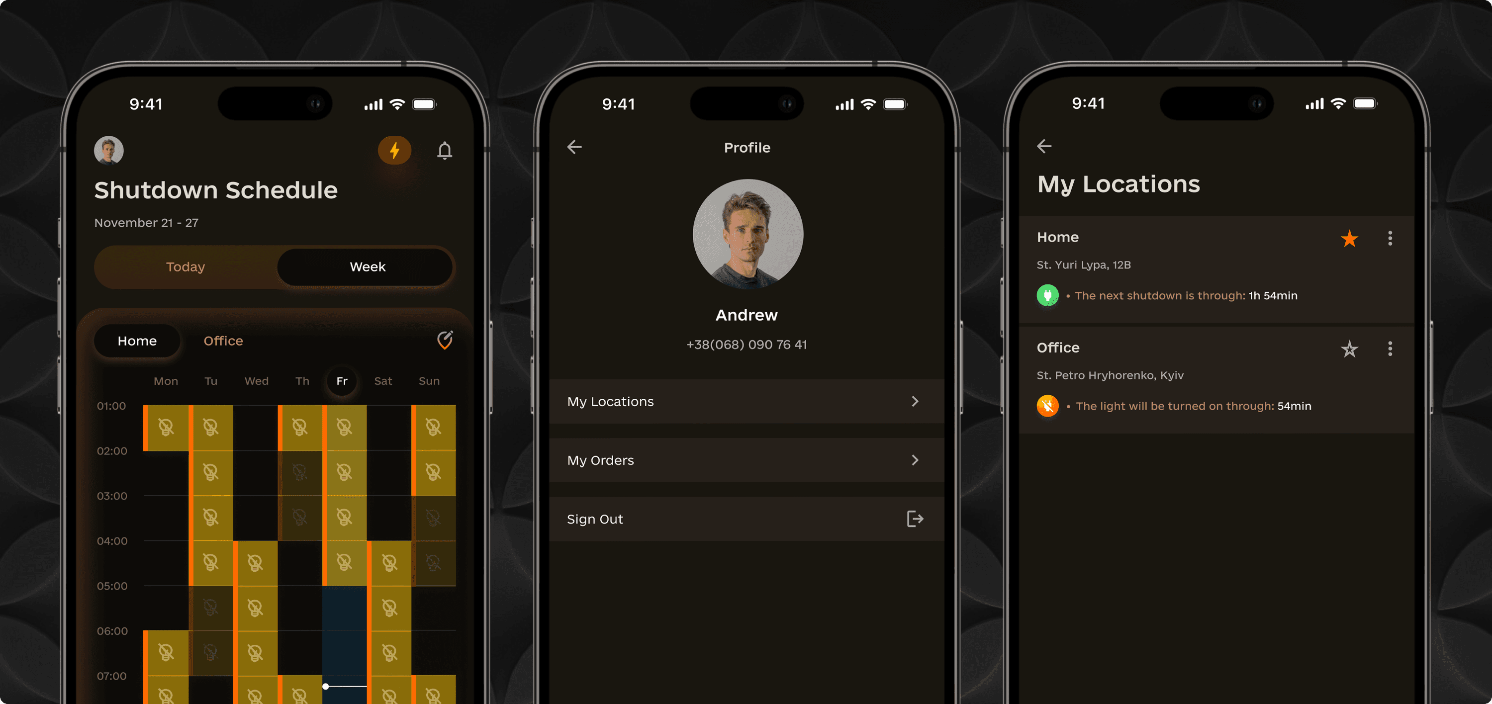
Users can access information about ongoing electricity outages, compare schedule states and keep the locations they care about close at hand.
The process followed the same pattern we use for mobile app design services: define the user job, design core flows, create UI states and shape a memorable product identity.
We started with the core job: helping people check current electricity outage schedules and understand what happens at different locations.
The app needed a simple way to move between saved places, add new locations and remove places users no longer wanted to track.
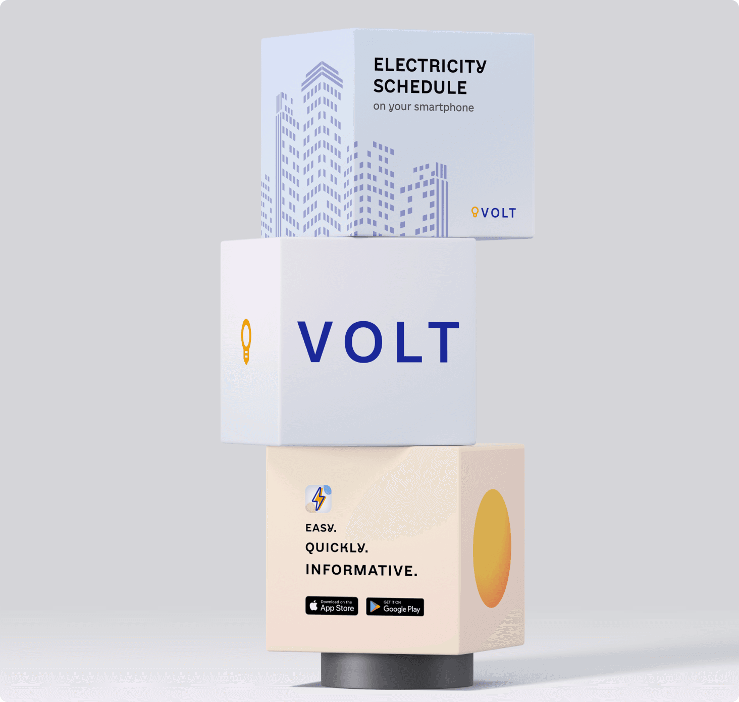
We designed a vibrant logo and brand identity around electricity, using bright energy cues and readable typography for a practical mobile product.
The final UI balances an eye-catching visual language with the functional clarity needed during active outages.
We used bright colors associated with energy and readable mobile typography so the app could feel dynamic while staying easy to perceive.
This project was a creative challenge: the app had to meet functional requirements and still provide an enjoyable user experience.
Alexander Vinokurov · CEO 99F, Art Director
The visual language extends across schedule, onboarding and location management screens without hiding the app's practical utility.
Need a mobile app that keeps utility, identity and navigation working together?
The project included mobile app design, UI/UX design, schedule interface design, location management UX and brand identity. See the related mobile app design services.