







 By Tetyana Vinokurova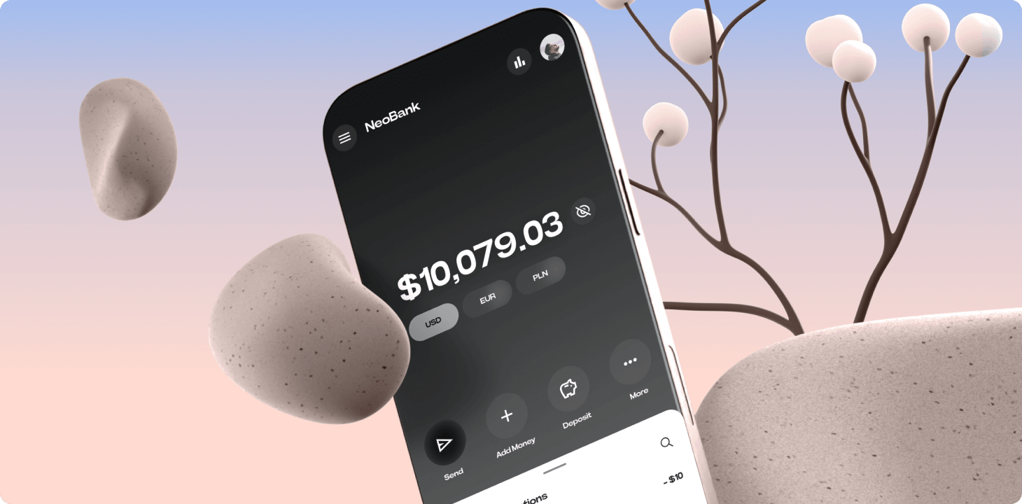
Bringing your idea to life as a mobile app MVP is not only a design task. It is a product decision task. The first version needs enough clarity to test the idea, enough polish to earn trust, and enough restraint to avoid spending months on features that do not prove the business.
The unique challenge of mobile app MVP design
A mobile MVP has less room for confusion than a desktop product. Users are working on a small screen, often with limited attention, and every extra step creates friction. If onboarding is unclear, permissions feel risky, navigation is hidden, or the first useful action is buried, the MVP may fail before the idea gets a fair test.
That is why MVP design is a balance between focus and credibility. Too many features slow the launch and dilute learning. Too few signals make the app feel unfinished. The right first version should show the product promise, support the core journey, and make the next product decision easier.
What should be included in a mobile app MVP?
- A clear onboarding flow that explains who the app is for and what value users get first.
- The primary user journey, designed end to end without forcing users through secondary features.
- Key empty states, error states, loading states, and permission screens, because these moments shape trust.
- A realistic prototype that lets founders, investors, developers, and testers understand the product before build.
- A lightweight design system for typography, buttons, inputs, cards, spacing, and navigation patterns.
- A launch-ready landing page or app store visual story that explains the same promise the app interface delivers.
Our MVP mobile app design process
We start mobile app design by reducing the product, not decorating it. Before Figma polish, we define the target user, the main problem, the first measurable action, and the screens needed to prove that action. This keeps the MVP from becoming a smaller version of a huge future product.
- Product framing: we turn the idea into a simple user promise and define what the MVP must prove.
- Flow mapping: we map onboarding, the core action, return paths, and edge cases before visual design starts.
- Wireframes: we quickly test layout, hierarchy, and interaction structure without over-investing in polish.
- Interactive prototype: we create a clickable version that can be reviewed, tested, and used for investor demos.
- High-fidelity UI: we design the screens with the right level of trust, brand, accessibility, and mobile interaction detail.
- Handoff or build support: we prepare the work for developers or connect it with mobile app development, a landing page, Webflow, Framer, or Next.js build.
Common MVP design mistakes
The most common mistake is treating an MVP as a cheap full product. Founders add social login, dashboards, referrals, notifications, admin tools, and advanced settings before the core behavior has been validated. Each feature sounds small by itself, but together they create a slow and unfocused launch.
- Designing too many user roles before the first user journey is proven.
- Starting with visual UI before the product flow is clear.
- Ignoring empty states, errors, and permissions until development.
- Copying mature apps instead of designing for the first learning milestone.
- Using a generic design system that does not match the product's trust level or behavior.
A practical example
For a fitness tracking MVP, the riskiest question is usually not whether the app can show a dashboard. It is whether users understand how to start tracking, see progress, and feel motivated to return. In that situation, we would prioritize onboarding, first workout setup, progress feedback, reminders, and a simple history view before advanced social or analytics features.
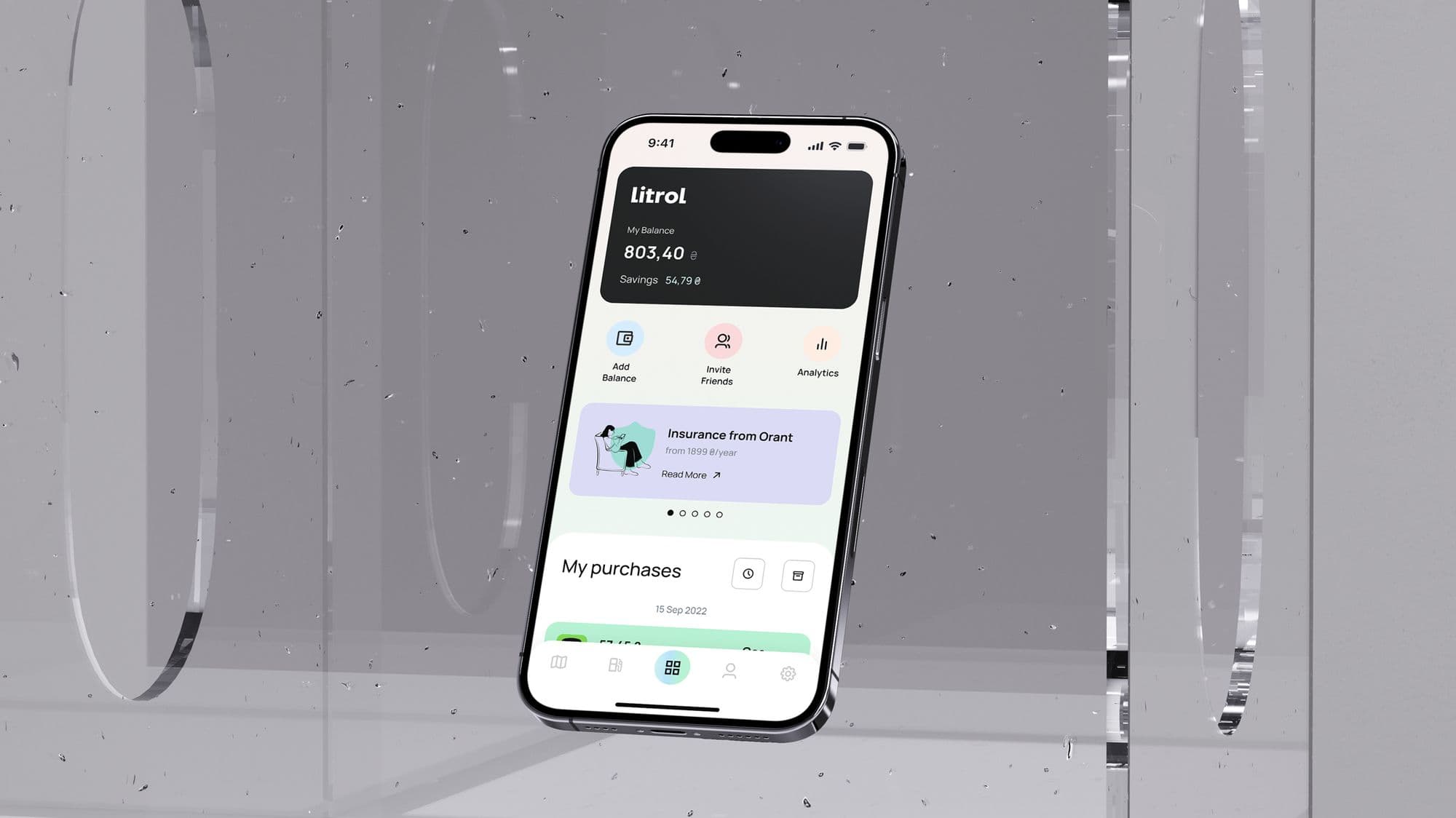
For a fintech MVP, the risk may be trust and comprehension. The product might need clearer permission screens, stronger account states, better microcopy around sensitive actions, and a prototype that explains money movement before any decorative layer matters.
How to know your MVP is ready for development
- A new user can understand the value proposition in the first minute.
- The main flow can be completed without verbal explanation from the founder.
- The prototype exposes the risky assumptions you need to test.
- Developers can identify components, states, and interactions without guessing.
- The landing page, app interface, and demo narrative all communicate the same product promise.
Bottom line
A strong mobile app MVP is not the smallest set of screens. It is the smallest believable product experience. Good MVP design helps founders launch faster, reduce expensive build mistakes, and learn from users before the product becomes too large to change.
Frequently asked questions.
Need this done instead of just read about it?
99 Francs is a senior product studio working outcome-based: no upfront payment, a fixed price per phase, and you pay at the end of a phase — only once you've seen it working. Tell us what you're building, and we'll reply with a phased plan and a fixed quote within one working day.