
99 Francs
sales@99francs.agency

HQ Paphos, Cyprus · worldwide

Case study · AI real estate app
Client
PixoftUkraine
Industry
Real estate, AI
Market
United States
Timeline
About 4 weeks
Team
2 designers
Platforms
Web appMobile webiOS appWebflow landing
Year
2023

Digsdy: An AI chat assistant for buying, selling and renting homes in the US, with its MVP designed in three weeks.

Pixoft, a software studio from Ukraine, was building Digsdy for the US market: you tell an AI assistant what home you need, and it answers with filters, homes on a map, property pages and the agents who sell them. We did the UX, the UI for desktop, mobile web and the native app, the brand, a landing page in Webflow and the investor pitch deck.

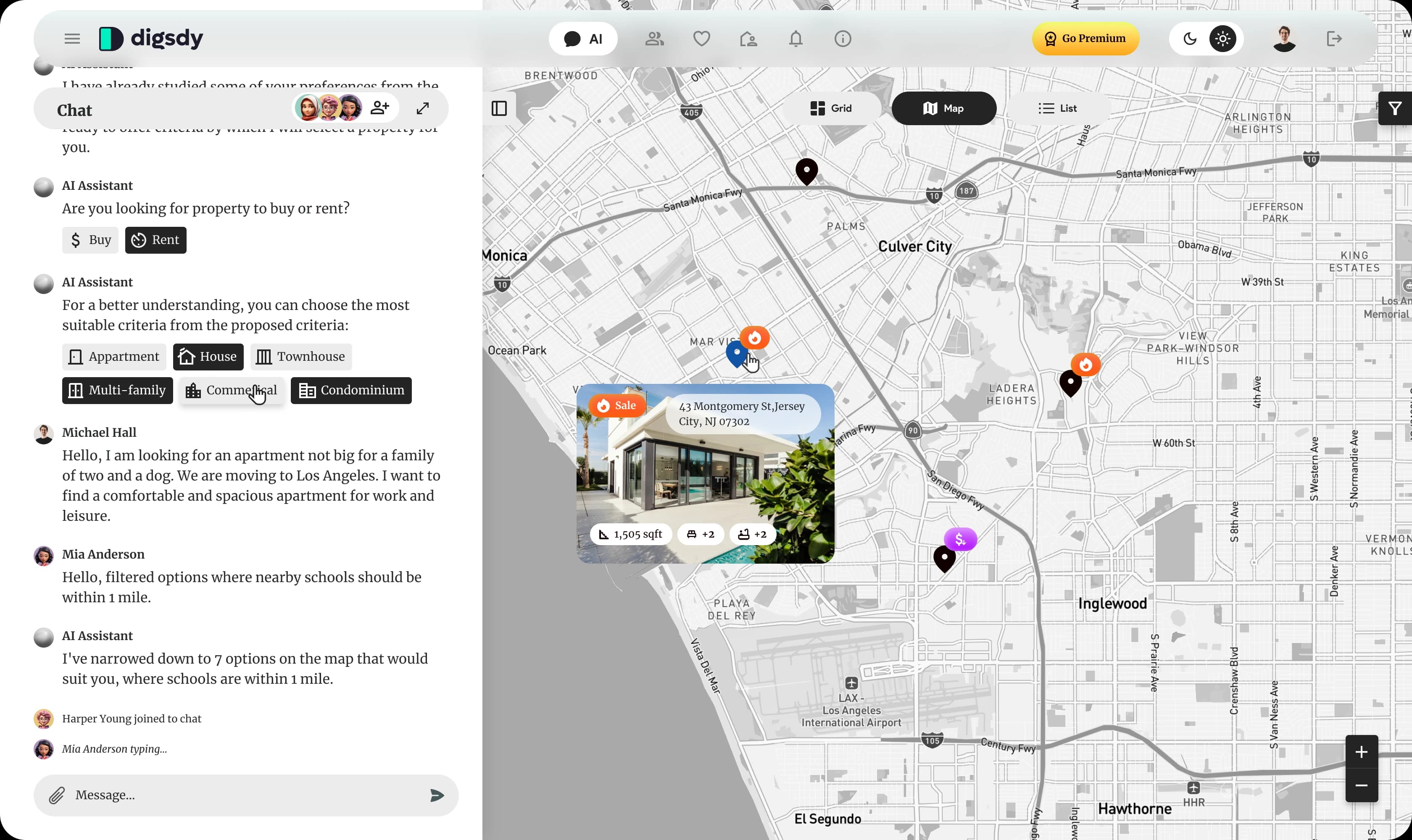
Digsdy web app: the AI chat on the left offers Buy or Rent and home-type chips, and the map of Los Angeles on the right shows the matching homes with a property card
Direct answer

Digsdy is a home search you talk to, and 99 Francs designed it end to end, from the UX to the pitch deck.

For Pixoft we designed the UX and UI of an AI real estate app for the US market: a chat that narrows the search with filter chips and answers with a map, property cards and full listings, on desktop, mobile web and a native app. The MVP design took three weeks; the brand, a Webflow landing page and the investor deck came with it.

Challenge

Make a chat feel like a property search, not a text box.

A buyer who types “an apartment for a family of two and a dog, schools within a mile” should not get an essay back. The first moderated user tests showed what they wanted instead.

Plain text answers were boring

Even for an MVP, testers did not want to read paragraphs. So the assistant answers in the form the question needs: filter chips, property cards, a map, a full listing or a list of agents.

People search together

Testers wanted to share the search with a partner or a friend. So the chat got invites: the faces of everyone in it sit in the header, with a “joined the chat” line and a typing indicator for each person.

An assistant with nothing to sell

Testers read the AI as unbiased, an adviser that shows things as they are. The deck cover says the same: “The most honest AI real estate agent”.

The property page decides

Price, photos, location, size and the details behind them are what a buyer comes for, so the next round of discovery went into the property page.
The AI chat

Six kinds of answer instead of a wall of text.

The assistant studies what the buyer asks and replies in the form that moves the search on. The chat can be collapsed to give the map, the grid or the listing the whole screen.

Text

A question or an answer, when that is all it takes.

Text + filter chips

Buy or rent, home type, number of bedrooms: one tap instead of typing.

Property cards

Homes with price, address, size and tags such as Sale, Good Price or Safe Area.

Text + map

The shortlist pinned on a map of the area the buyer asked about.

Property details

The whole listing inside the chat: photos, price, facts and description.

Agents

The agents who sell the home, each with an Add to Chat button.
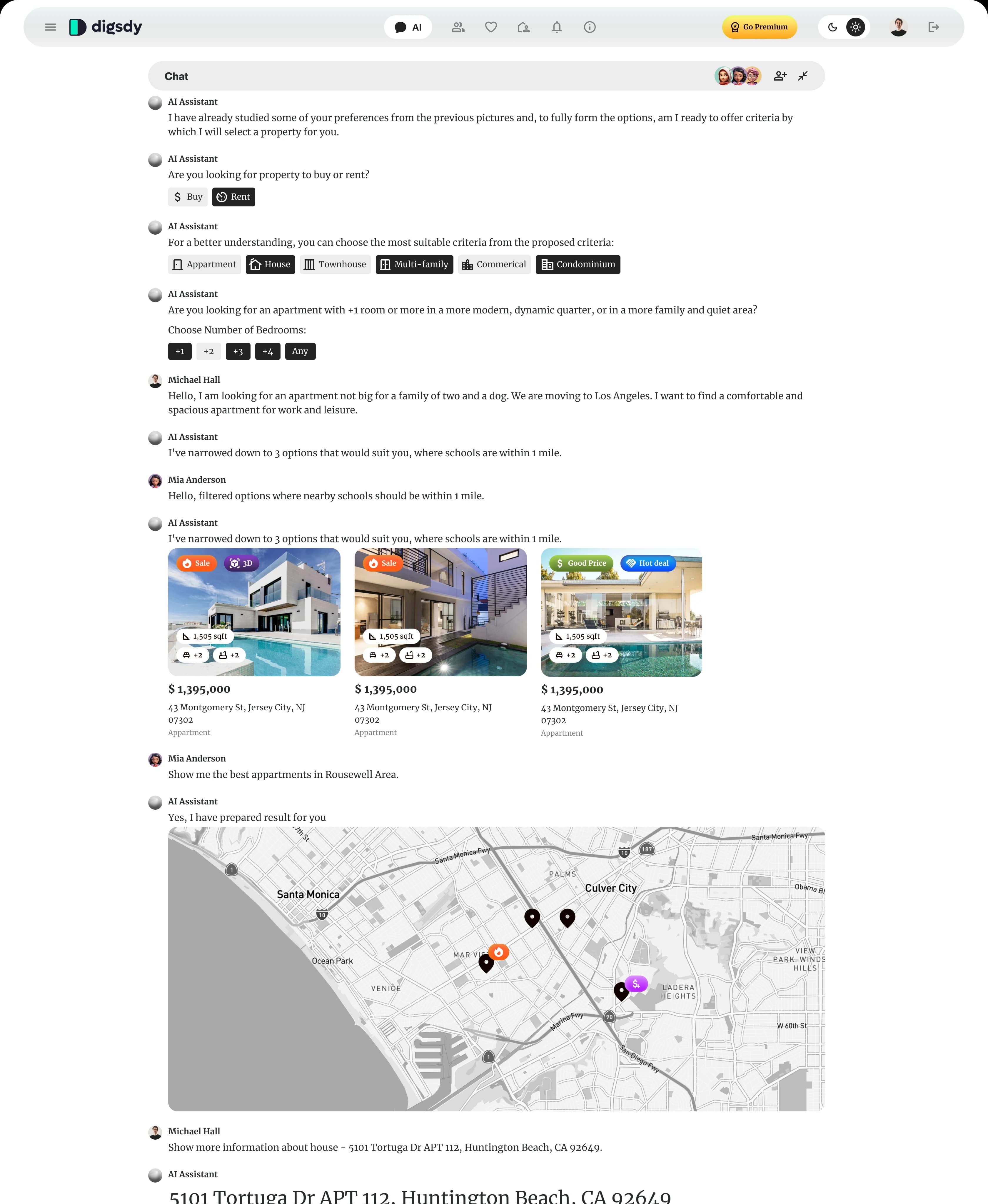
One Digsdy chat with every message type: Buy or Rent chips, home types and bedrooms, three property cards with Sale and Good Price tags, then a map of the shortlist
Home

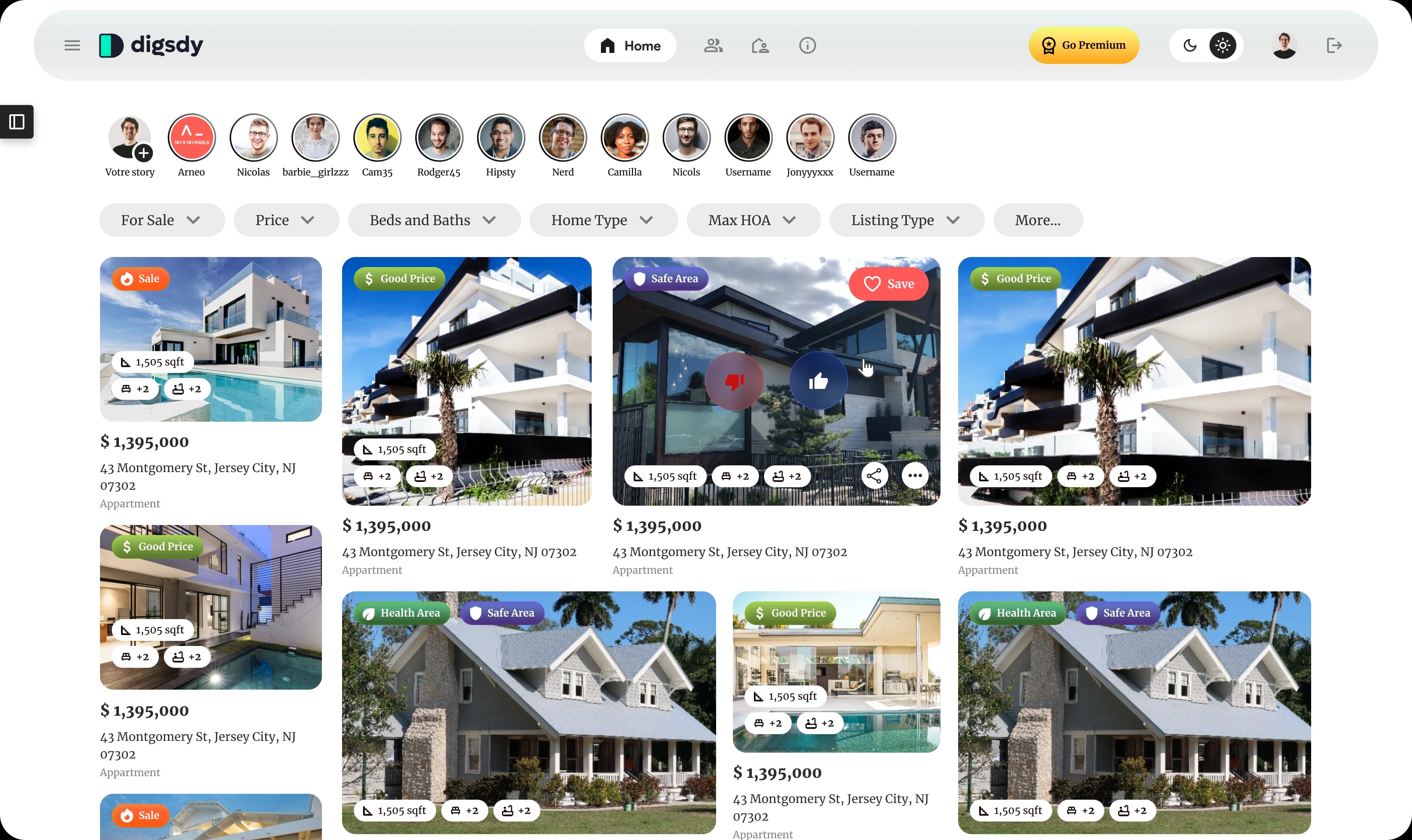
A feed of homes, with stories from real agents.

The grid view reads like a feed: stories from agents across the top, the filters a US buyer expects, and tags that answer the first question before the click.

Digsdy home feed: agent stories in a row, filters for sale, price, beds and baths, home type, max HOA and listing type, and a grid of homes tagged Sale, Good Price, Safe Area and Health Area
Tags
Sale, Good Price, Hot Deal, Price Drop, Safe Area and Health Area: a small set of coloured tags runs through the cards, the map pins and the chat, so a home reads the same wherever it shows up.
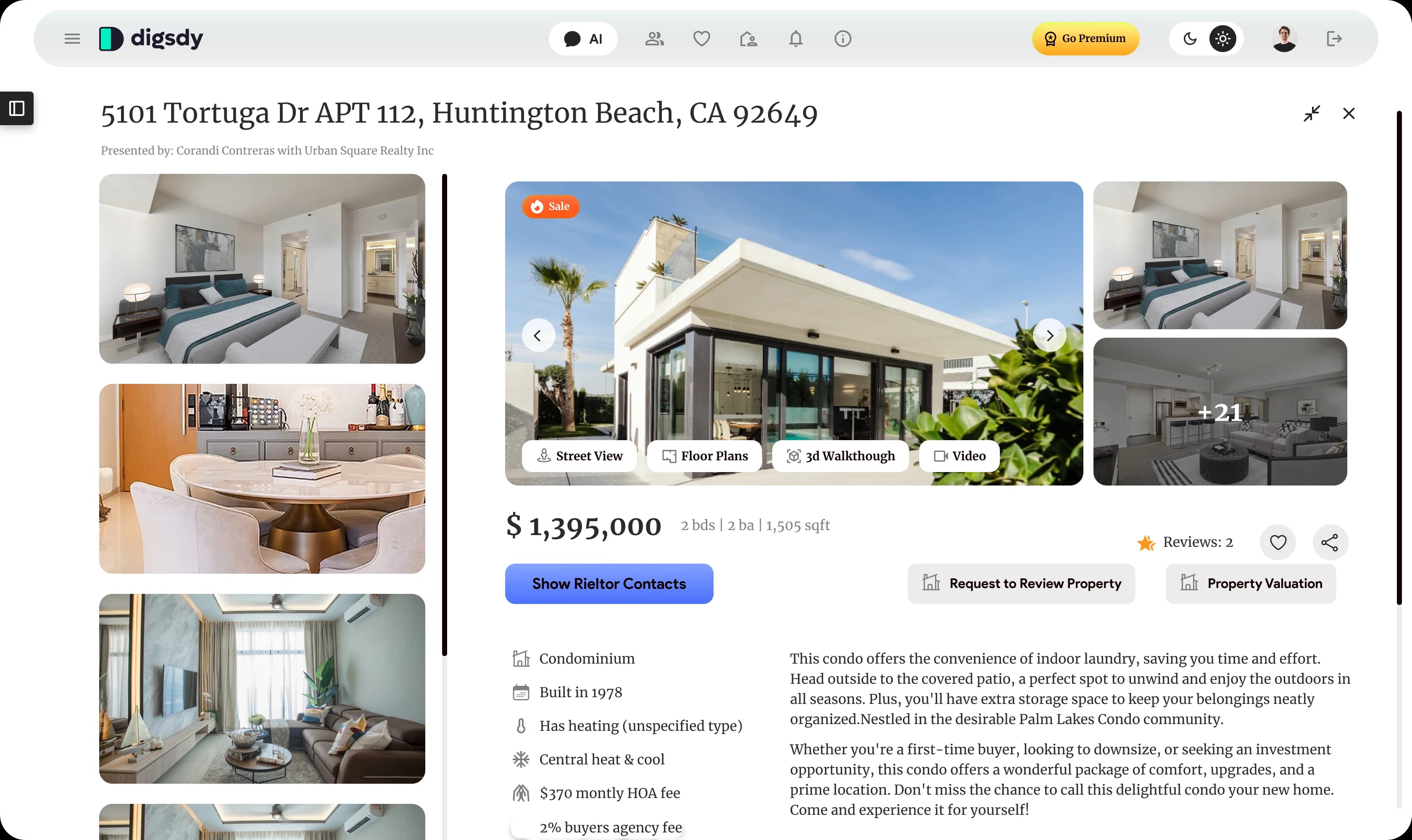
Property page

Everything a buyer checks before calling an agent.

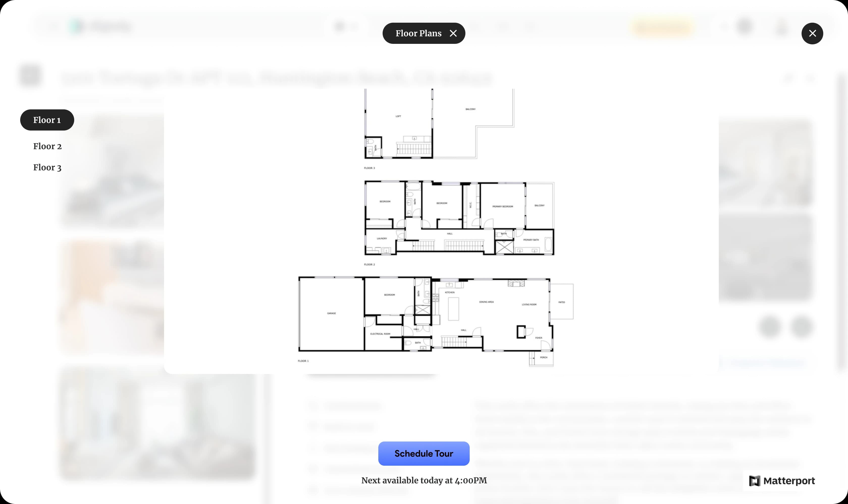
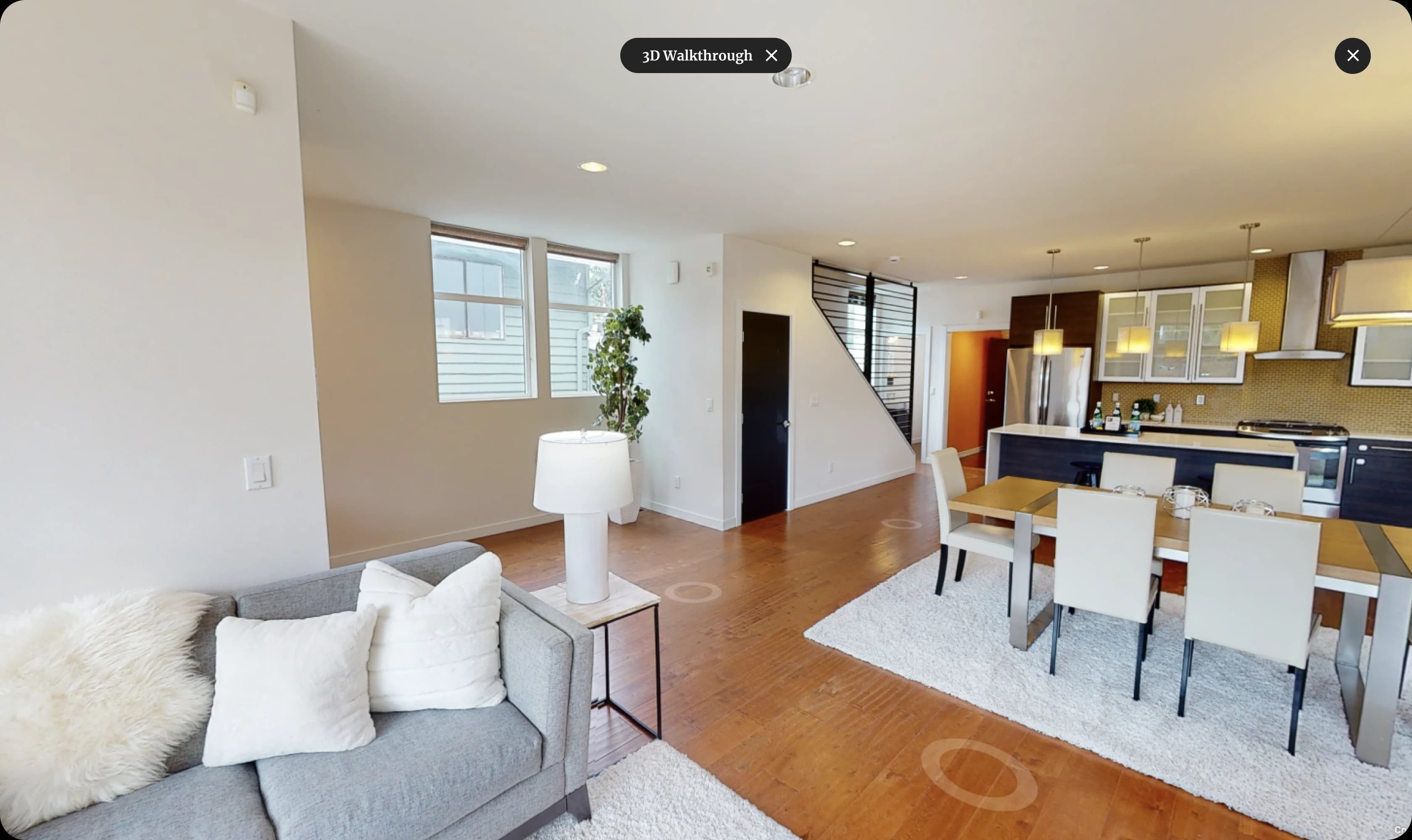
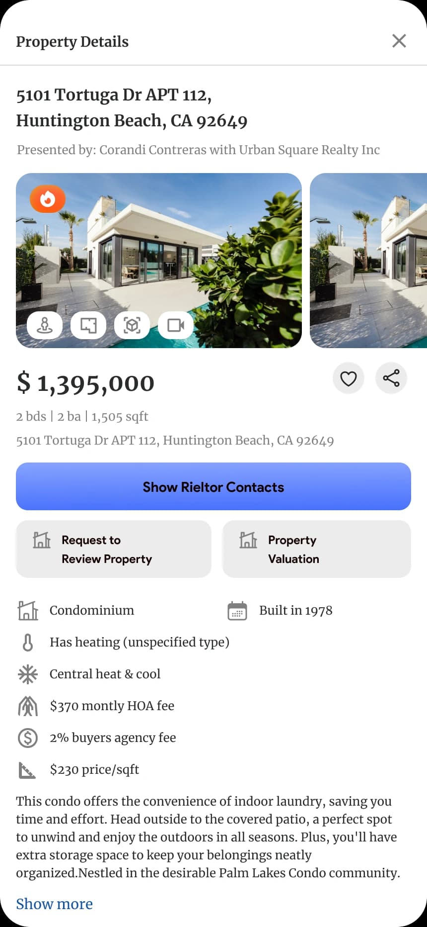
Photos, street view, floor plans, a 3D walkthrough and video sit on the hero image; the facts, the HOA fee and the description below it. The agent’s contacts, a request to review the property and a valuation are one tap away.

Digsdy property page for a condo in Huntington Beach, CA: a photo gallery with Street View, Floor Plans, 3D Walkthrough and Video buttons, the price, the facts and the description
Floor plans opened over the property page, with Floor 1, 2 and 3 tabs and a Schedule Tour button
A 3D walkthrough of the living room and kitchen opened over the property page
Agents

The agent joins the conversation.

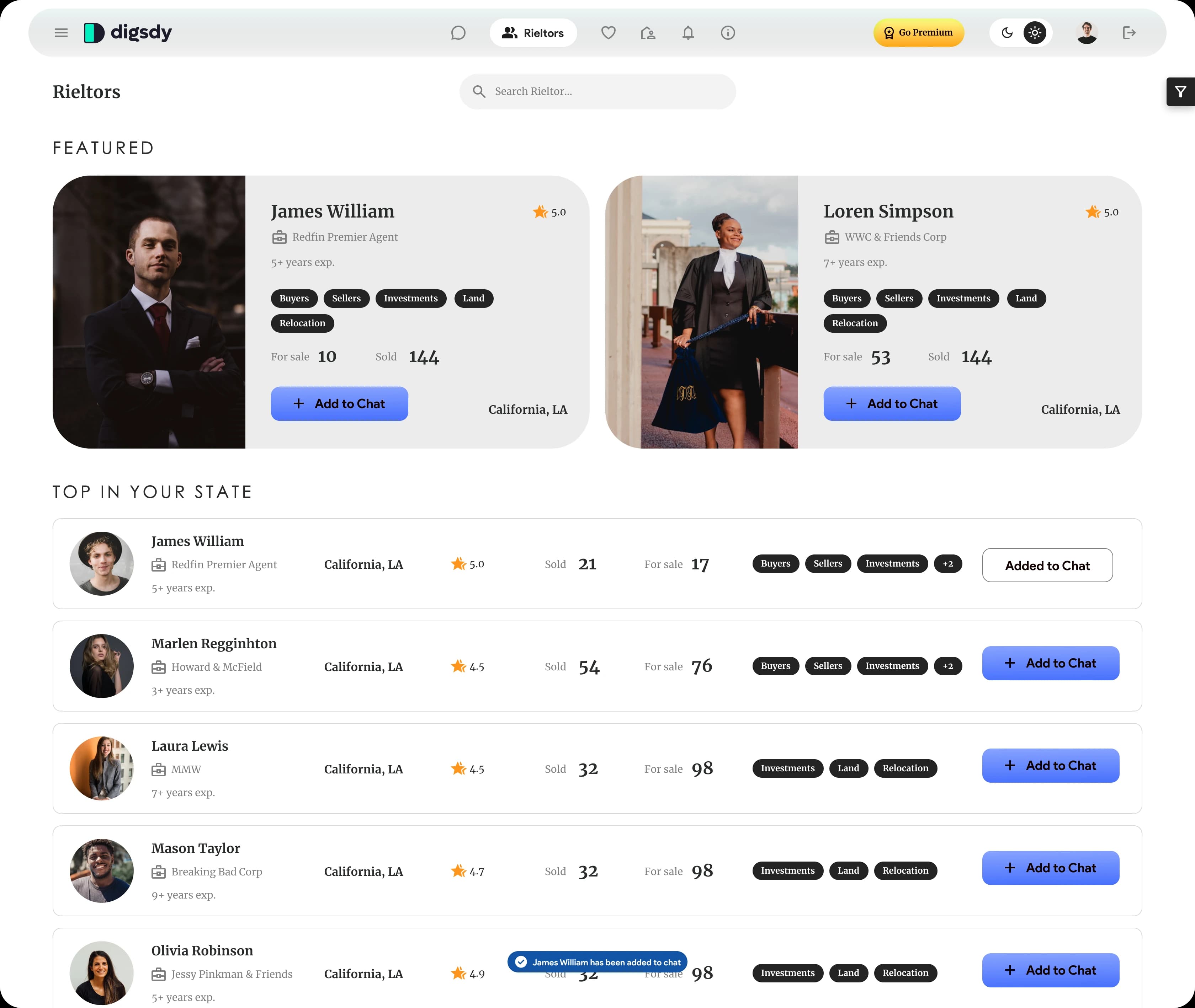
Featured agents and the top ones in your state, with ratings, homes sold and for sale, and their specialities. Add to Chat brings an agent into the same chat as the buyer and the assistant, so nobody has to repeat the brief.

Digsdy agents catalog: two featured agents and a Top in your state list with ratings, sold and for-sale counts, speciality tags and Add to Chat buttons
Process

From UX notes to an MVP, a brand and a deck in four weeks.

Two designers, led by Tetyana Vinokurova, worked through the product in this order.

01

Map the funnel

In UX notes we laid out the route from landing to first results and the options for collecting contact details: sign up with Google, Facebook or Apple, sign up with three fields, or let people straight into the app, ask for an email after the first steps and for a phone number when they want to see an agent.
02

Design the MVP in three weeks

Sign up and onboarding, chat with the map, grid and list views, the property page, agents, saved homes and the account, for desktop at 1680 and mobile web at 320 and 430, plus the native app screens.

03

Give it a brand and a launch kit

The Digsdy logo, ad creatives and stories, posters, a landing page we built in Webflow and the investor pitch deck.

04

Design the next features

After the MVP the client asked for what came next: live streams of homes, an info layer with home values on the map and Go Premium for agents.

Mobile web

The same chat in a thumb's reach.

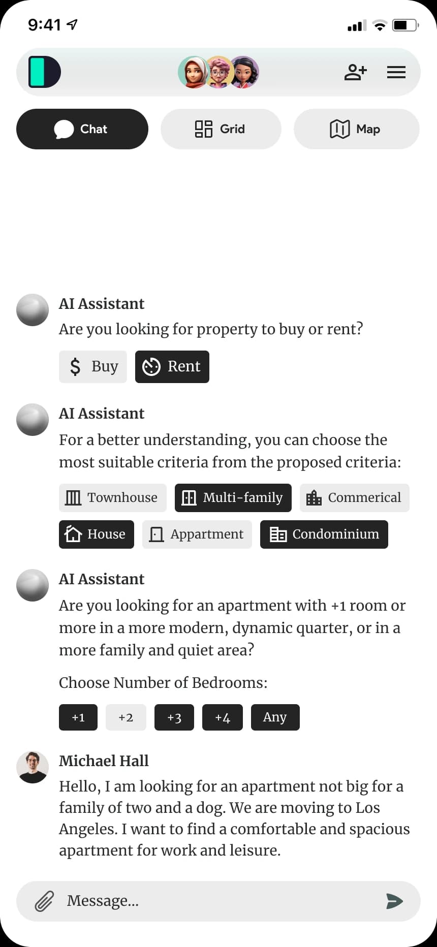
The web app has mobile versions at 320 and 430 pixels: Chat, Grid and Map become three tabs, and the faces of everyone invited sit in the header.

Digsdy mobile web chat with three people invited: Chat, Grid and Map tabs, Buy or Rent and home-type chips
Digsdy property page on mobile web: photos, price, a button for the agent's contacts, Request to Review Property and Property Valuation
Native app

And an app with a tab bar of its own.

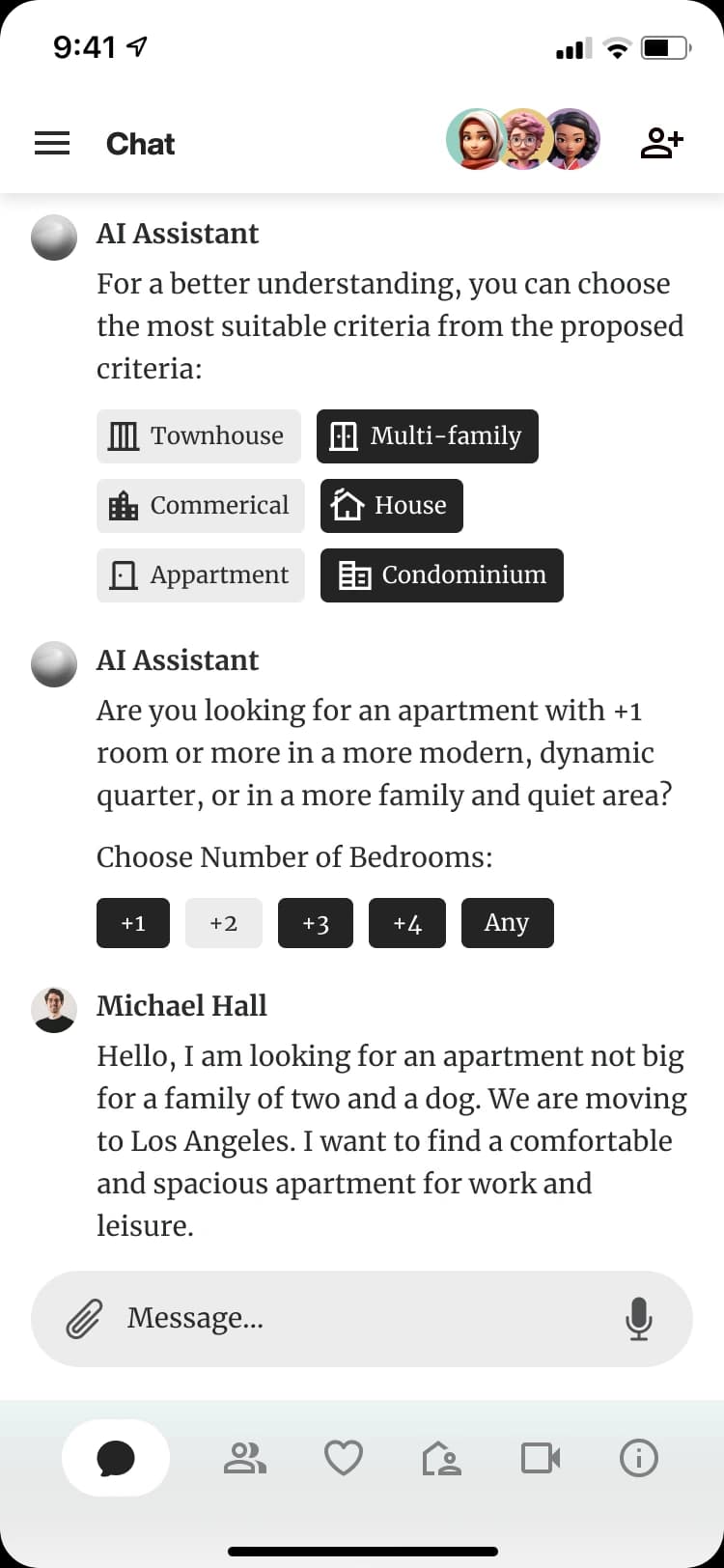
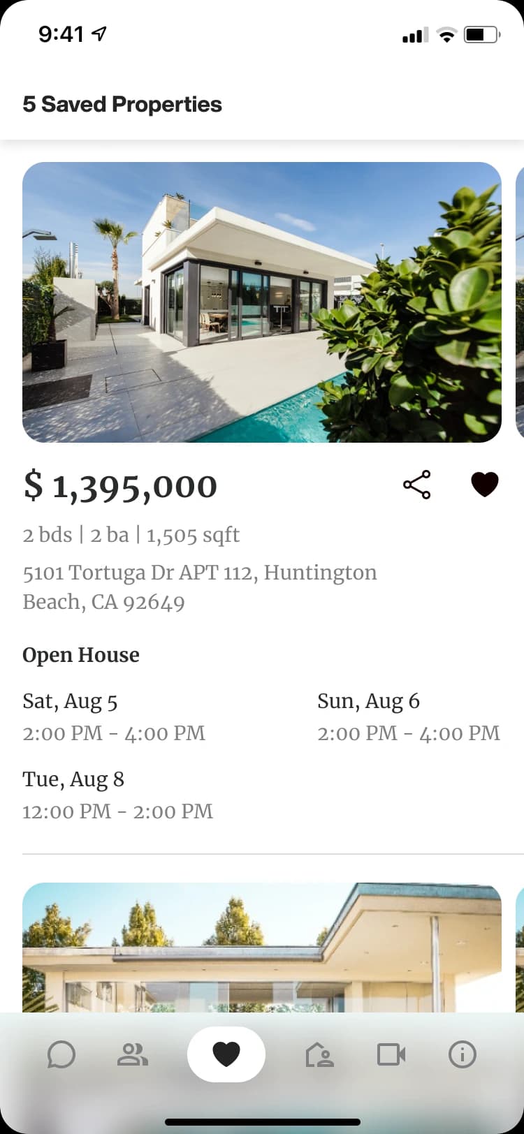
For the native app we designed the splash, sign up and sign in, the chat, the agents and saved homes, with a bottom tab bar in place of the web header.

Digsdy iOS app chat: the assistant offers home types and bedroom counts, and Michael Hall describes the apartment he needs
Digsdy iOS app saved properties: a condo in Huntington Beach with price, size and open house times
Brand identity

A name from “digs”, and a mark that fits an app icon.

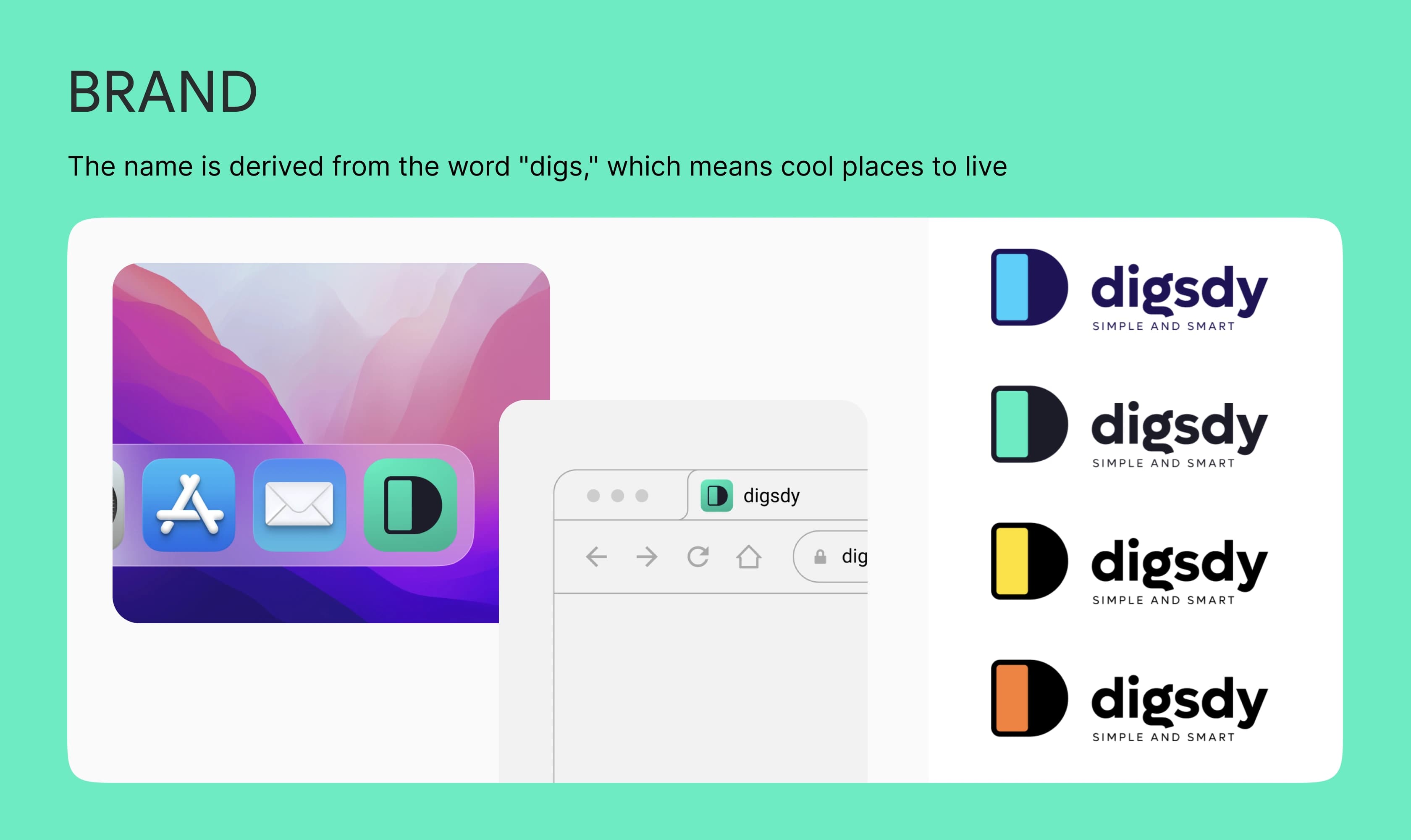
Digs is slang for a place to live. The mark is a rounded D with a bright core that works as an app icon, a browser tab icon and a logo, in four colours.

The Digsdy brand slide: the name comes from digs, a cool place to live; the D mark as an app icon and a browser tab, and the logo in four colours
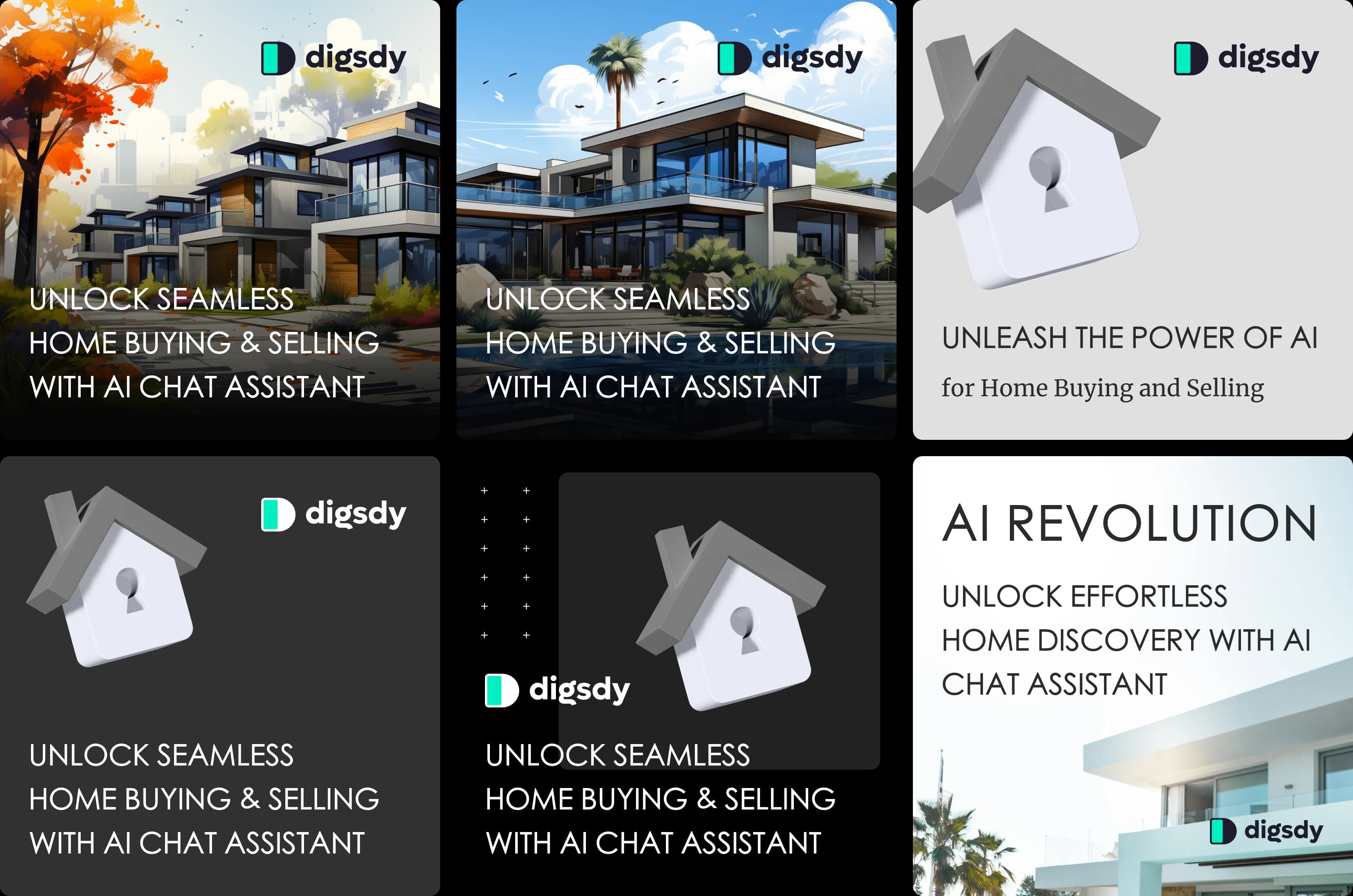
Six Digsdy ad creatives at 1080 by 1080: modern houses and a white 3D house with a keyhole, with lines such as Unlock seamless home buying and selling with AI chat assistant
Campaign
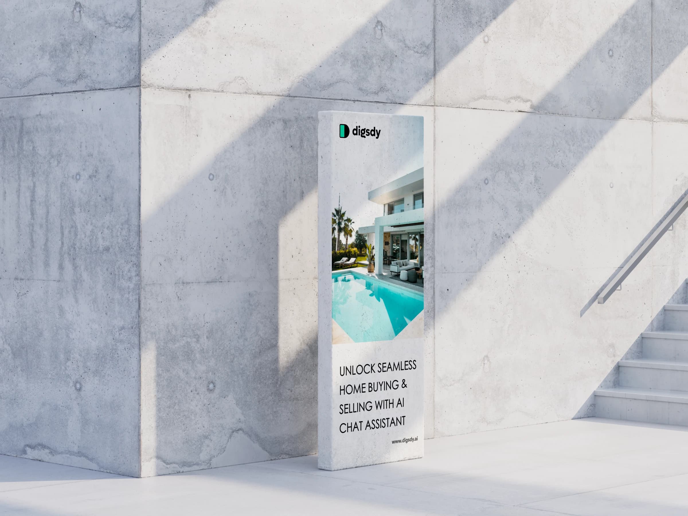
Most of the square ads, the story and the tall posters carry one line, “Unlock seamless home buying & selling with AI chat assistant”, over modern homes or a white 3D house with a keyhole.
A tall Digsdy poster with a villa and its pool, standing against a concrete wall
The cover of the Digsdy investor deck: The most honest AI real estate agent, over a glass building on a green gradient
Pitch deck and landing page

The story for investors, and a page for the first users.

The investor deck runs from the problem and the market to the business model, technology, marketing, competition, the development plan and the brand. We built the landing page in Webflow.

After the MVP

Then the client asked for what comes next.

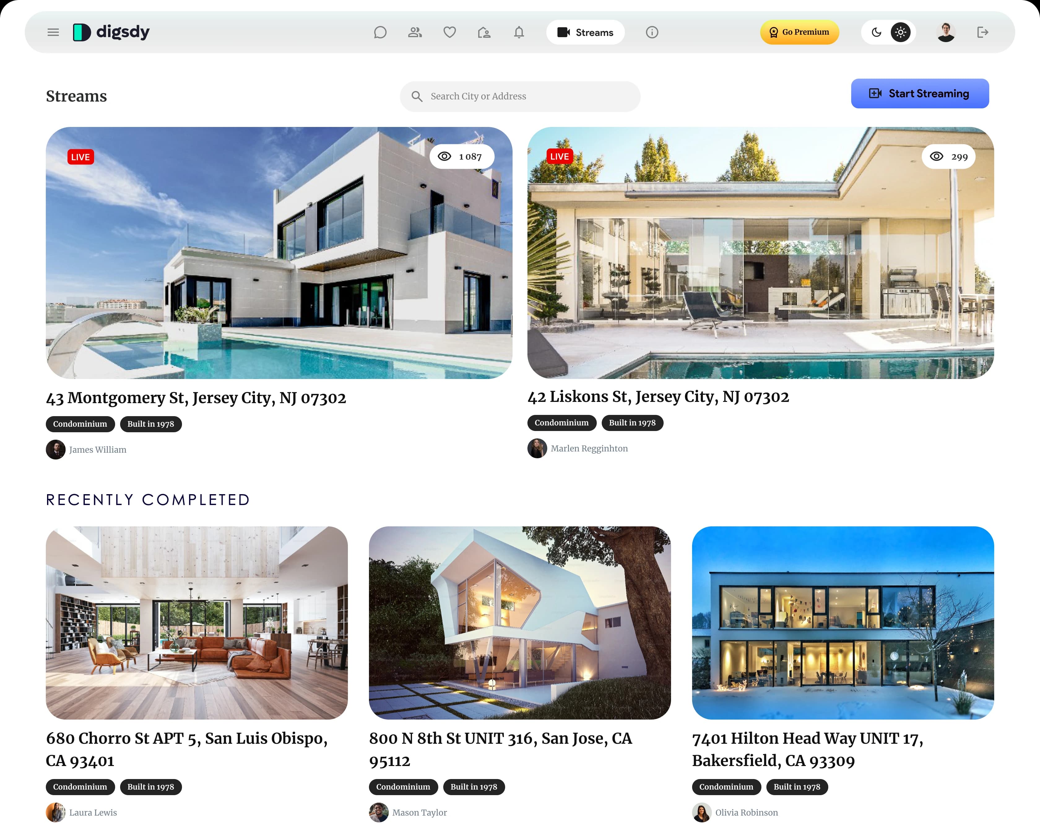
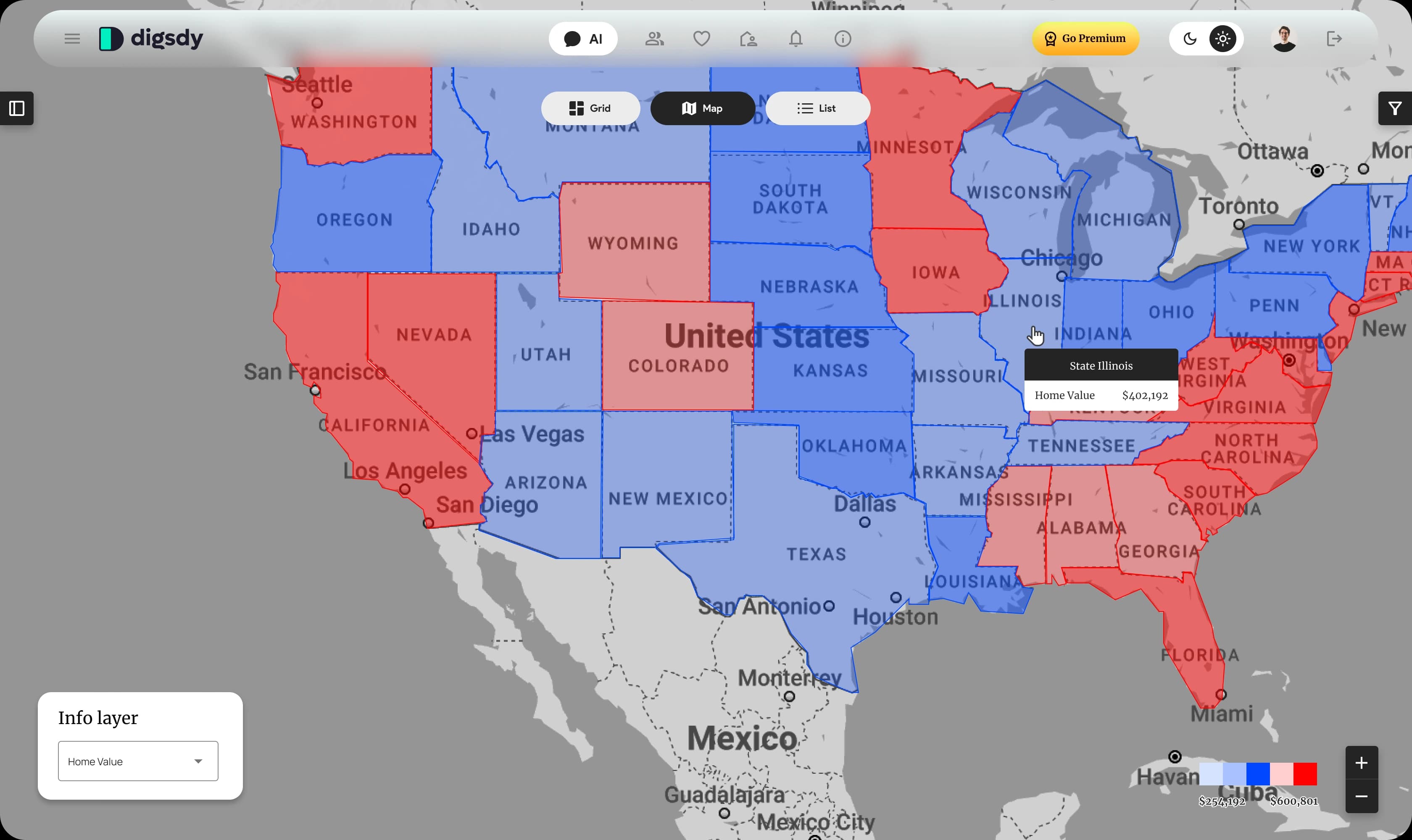
Once the MVP was designed, we went on to the next version: live streams of homes with a pin on the map, a home-value layer for the whole country and Go Premium for agents.

Digsdy Streams page: two live home tours with viewer counts, a Start Streaming button and a Recently completed list of homes in California
Digsdy info layer: a map of the US with states shaded by home value and a tooltip for Illinois
Info layer
Pick Home Value in the info layer and the map turns into a heat map by state, with the figure on hover.
Outcome

A product, a brand and a deck, handed over in a month.

Pixoft got the full design of the MVP and the next version, the brand and the launch materials. What happened to Digsdy after that is the client’s story, so we leave it there.

3 weeks

MVP design

From UX notes to the MVP screens; about four weeks in all with the features that followed.

3

surfaces, one product

The web app at 1680, mobile web at 320 and 430, and the native app screens.

6

message types in the chat

Text, filter chips, property cards, map, property details and agents.
Client testimonial
Tanya is a great person to work with! She is a hard worker and a highly qualified UI/UX specialist thinking outside the box. Working with Tanya was totally enjoyable. She helped us to build from scratch a design for mobile application in very short terms. Highly recommend!
Christian ShpilkaChristian Shpilka · Co-founder of Pixoft
Guides

Further reading

Buyer guides9 min read

MVP Development Cost in 2026: Real Price Ranges

What an MVP costs in 2026, by type: landing page and waitlist, clickable prototype, web app, mobile app and AI MVP, with published price ranges, what drives the budget and the costs that come after launch.

Product design · MVP

Building an AI product and need it designed before the money runs out?

We design the UX and UI of the first version, the brand and the pitch deck, and can build the MVP too.

AI chat · Web app · Mobile · Brand · Pitch deck
Case study FAQ

Questions about the Digsdy project.

Digsdy is an AI chat assistant for buying, selling and renting homes, built by Pixoft for the US market. The buyer says what they need in the chat; the assistant narrows the search with filter chips and answers with homes on a map, property cards, full listings and the agents who sell them.

99 Francs designed the UX and UI of the Digsdy web app for desktop and mobile web, the native app screens, the brand identity with ad creatives and posters, a landing page built in Webflow and the investor pitch deck.

About four weeks in total, with two designers. The MVP design took three weeks; after it the client asked for the next features, such as live streams of homes and a home-value layer on the map.

Give the assistant more than text. In Digsdy it answers with filter chips, property cards, a map, the full listing or a list of agents, depending on the question, and the buyer can invite a partner into the same chat. We design AI products this way: the interface does the work, the chat only steers it.

Yes. We design the UX and UI of the first version, the brand and the pitch deck, and can build the MVP too. Digsdy’s MVP design took three weeks. See also real estate website design and development.

Start a project

Planning something similar?

Tell us what you are building and we'll reply within one working day with a fixed price for the site or the first phase, or with the two or three questions we need answered first.
Prefer to talk? Book a free intro call.

Attach a brief (optional)

PDF, Word, Keynote or images, up to 25 MB. Skip it if it's under NDA.

By sending this you agree to our Privacy Policy.